Digital Art

Jack the Ripper

Jack the Ripper
Jack the Ripper

Warrior

Warrior
Warrior

da005

da005
da005

The alliance

The alliance
The alliance

Elemental

Elemental
Elemental

Blind Batman

Blind Batman
Blind Batman

The Mask

The Mask
The Mask

Purge: Red Hand

Purge: Red Hand
Purge: Red Hand

Photography

Explosion

Explosion
Explosion

Silent Wingss

Silent Wingss
Silent Wingss

Boom boom

Boom boom
Boom boom

Midnight Magic

Midnight Magic
Midnight Magic

Missing Garden

Missing Garden
Missing Garden

Drowning

Drowning
Drowning

Shyness

Shyness
Shyness

Show Off

Show Off
Show Off

Freebies

Video Wordpress Theme

Video Wordpress Theme

Wallpaper Calendar

Wallpaper Calendar
Wallpaper Calendar

Pop-Up Design

Pop-Up Design
Pop-Up Design

Horizontal Accordion

Horizontal Accordion

2K11 Desktop Calendar

2K11 Desktop Calendar

Gameliso Magazine

Gameliso Magazine
Gameliso Magazine

2011 Calendars

2011 Calendars
Wallpaper

HTC Aurora Concept

HTC Aurora Concept
HTC Aurora Concept

Typography

Tron Legacy countdown

Tron Legacy countdown

TYPOGRAPHY

TYPOGRAPHY
TYPOGRAPHY

Work 2010

Work 2010
Work 2010

Let there be light

Let there be light
Let there be light

Paper & Love Typeface

Paper & Love Typeface

Good Food

Good Food
Good Food

Write A Bike

Write A Bike
Write A Bike

Fauve

Fauve
Fauve

Business Card

Black Businesscards

Black Businesscards
Black Businesscards

280dg Business Cards

280dg Business Cards

Black Rooster

Black Rooster
Black Rooster

3bymesa

3bymesa
3bymesa

ID Business Cards

ID Business Cards
ID Business Cards

Kudosis

Kudosis
Business Card

M- logo

M- logo
M- logo

Mobile Caffeine

Mobile Caffeine
Mobile Caffeine

Photoshop Tutorials

Web Hosting Layout

Web Hosting Layout
Web Hosting Layout

Surreal Environmental

Surreal Environmental

Dark Web Design

Dark Web Design
Dark Web Design

Futuristic Photo Illustration

Futuristic Photo Illustration

Vintage Illustration

Vintage Illustration

Adrenaline Filled Car

Adrenaline Filled Car

Glossy and Shiny

Glossy and Shiny
Glossy and Shiny

Under-Water Text Effect

Under-Water Text Effect

Design News

Futuristic Photoshop Effects

Futuristic Photoshop Effects

Survive a Job Interview

Survive a Job Interview

Dev & Design Resources

Dev & Design Resources

Sans-Serif Explained

Sans-Serif Explained

iPhone Interface Design

iPhone Interface Design

Poster Designing Tips

Poster Designing Tips

Error 404 Page Tips

Error 404 Page Tips
Error 404 Page Tips

Redesigning Amazon

Redesigning Amazon
Redesigning Amazon
Showing posts with label typography. Show all posts

Typography : Tron Legacy Countdown

Saturday, January 8, 2011

Obviously, I'm pretty excited about the release of Disney's Tron Legacy film. So much so that I decided to create a new poster design for every day counting down to the big launch. This was a bit taxing to come up with a different color and number design, but I'm happy to say it worked out and I launched the final design today.

All of these numbers were custom built in Illustrator and ported to Photoshop where I applied my backgrounds, effects and textures.

See more of my work at Signalnoise.com and follow me on Twitter

Tron Legacy countdown


Typography Works 2010

Sunday, January 2, 2011

Straight from Belgium Raphael Vicenzi is a freelance graphic designer specialized in illustrations and typography, and when a project require both of these styles, Raphael make sure that fireworks will come out at the end of project. Check it out!

Works 2010


By : Raphael Vicenzi

Happy New Year Typography

Saturday, January 1, 2011

Happy New Year by wecoastdesign is a wonderful start for a new year. Fresh, shiny and sweet. Happy New Year to all of you.

Happy New Year


Fauve Typography

Friday, December 31, 2010

Produced with 125 Creative, commissioned by the Rees Bradley Hepburn agency. The virtual letter lightboxes were made as the cost of a real build was too expensive. Rough composite renderings were produced live at the photo shoot to reassure the client that the virtual route was indeed the right way to go.

Fauve


By : Mr. Murdoch

Write a Bike Typography

Write a Bike


By : Juri Zaech

Good Food Typography

An experiment with food and type. It's based in Quatro (the beta version), a beautiful type by pprwrk studio.

Good Food


By : Karen CantĂș

Creative Paper & Love Typeface

Originally created with a flat typeface in mind, paper & love is based on an octagonal grid and origami folds. The digital version represents this concept of origami by emphasizing transparency and by focusing on the shapes of the letter. The majority of the two-dimensional letters can be obtained by simply folding thin strips of paper and by following the octagonal grid. By taking what I had initially envisioned for the digital version, I created a new set of letters in 3D using paper, an x-acto knife and, of course, love (corny but true) !

Paper & Love Typeface


Creative Paper & Love Typeface


By : Chris Berthe

Typographic Illustrations

Wednesday, December 29, 2010

Hand lettered - Illustrator effected

Typographic Illustrations


By : Rutger Paulusse

AMAZING TYPOGRAPHY

AMAZING TYPOGRAPHY by niyi okeowo

TYPOGRAPHY


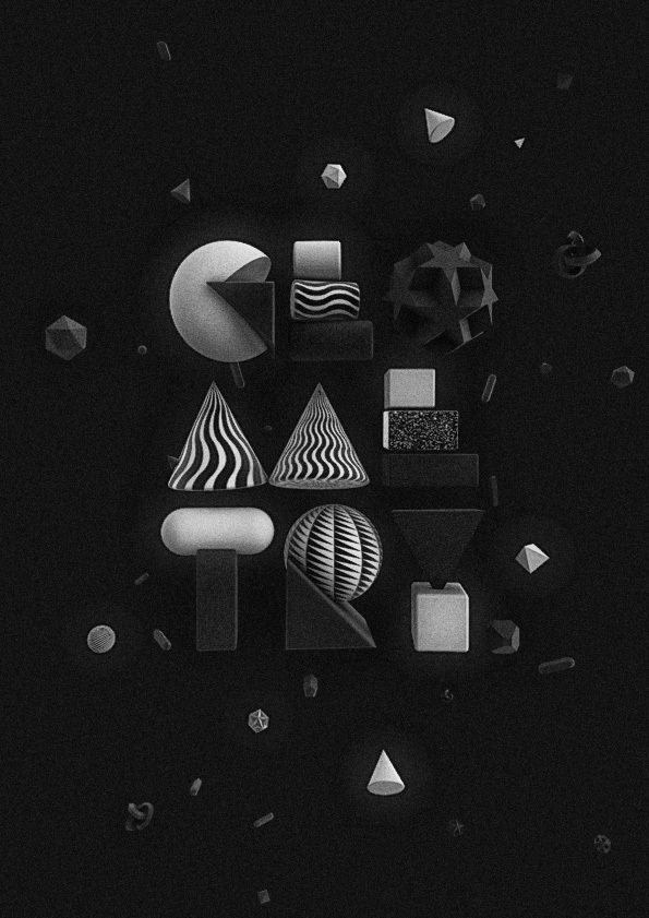
Geometric Typography

Typographic & morphological experimentation.

Geometric Typography


Source : http://www.behance.net/fclaps

Let there be light 3D Typography

Sunday, December 26, 2010


Let there be light


By : Jeff Osborne

Five Principles for Choosing and Using Typefaces

Thursday, December 16, 2010

For many beginners, the task of picking fonts is a mystifying process. There seem to be endless choices — from normal, conventional-looking fonts to novelty candy cane fonts and bunny fonts — with no way of understanding the options, only never-ending lists of categories and recommendations. Selecting the right typeface is a mixture of firm rules and loose intuition, and takes years of experience to develop a feeling for. Here are five guidelines for picking and using fonts that I’ve developed in the course of using and teaching typography.

Five Principles for Choosing and Using Typefaces


Read More : http://www.smashingmagazine.com/2010/12/14/what-font-should-i-use-five-principles-for-choosing-and-using-typefaces/

Whale, a way too fat italic

Whale, a way too fat italic By: Davide Mottes


Designer : Davide Mottes

Large Type in Abandoned Spaces

For my Master's in Communication Design I decided to create type sculptures in some of London's abandoned spaces. The large type was constructed using materials found in situ and the chosen words reflect some aspect of the abandoned space. After construction, each piece was photographed using a large format, 5x4 camera. This body of work was exhibited at the Mall Gallery, London in 2006 and featured in Time Out Magazine. These four photographs will also feature in a forthcoming book The A-Z of Ideas by John Ingledew (Laurence King Publishing).

Large Type in Abandoned Spaces by Alexander Shields


Designer : Alexander Shields

Scheppende Stad : Gent

Gent Scheppende Stad (Ghent Creative City) is an initiative of the city council of Ghent to (together with several creative forces/different sectors of society) look for solutions for the urban challenges, so they can shape the future of Ghent together.

Gent Scheppende Stad has been organized as a network of equal partners (companies, associations and individuals). There is no membership, everyones free to commit themselves for a short or long period.

Soon created 4 big letters G, E, N and T, on which the habitat of Ghent (GENT) was represented by means of scale models.

Gent: Scheppende Stad by Coming Soon


Via : http://www.typographyserved.com/gallery/Gent-Scheppende-Stad/827488

The Kitchen of Typography

Typography Treatment for the new deck of cards of the Lovit Store

The Kitchen of Typography by Pablo Alfieri


Designer : Pablo Alfieri
 

2011 ·Wootpix